
Development of Collage 1


So this was my first attempt which I was really unhappy with as it looked too messy and crowded. But it does show my basic first idea for how nightmare visuals would cover her dress. I think I'm going to take it all off of the dress and start rethinking the dress colour and the elements to go on to it.

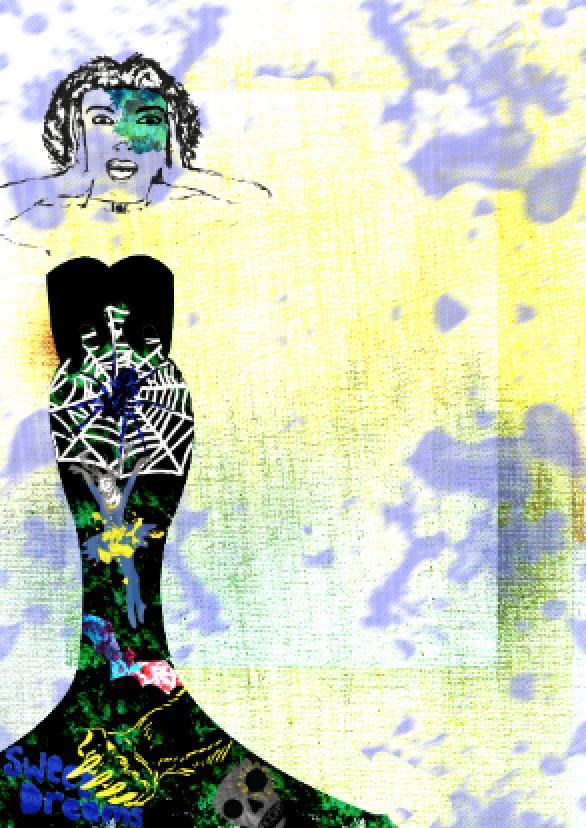
Here is my first collage so far. I think it is better than my first attempt because I think each visual has it's own space and also the green and black background that I made from a pink paint splat shows my idea that her nightmares are taking over her as the green is coming over her black dress. I still think it is quite messy so I will be doing some more investigation into the right layout for this collage.

I then changed a couple of the colours to narrow my colour scheme of the nightmare elements to blue and yellow so that it looks more cohesive but still looks quite chaotic and obscure. I also added a splat to her face to reinforce my theme of the nightmares taking over her.

I took the same yellow splat that is on the ballerina stag and posterised it and inverted the colour to turn it blue. I took inspiration from Jeff Koons' work as he mixes colours, patterns and imagery that almost compete with each other but it works. Also this poster that has this randomness that I wanted to put into my collage somehow.


I moved the woman to the left of the page to allow more space for a more intricate background

I placed some different coloured canvas to begin to build up some depth and texture.

I blended the prints together using gradient tools and blending modes to implement the yellow as part of my colour scheme.
I darkened areas of the blue paint splats to increase its impact

I decided to take some more photos to use more photography, as although I have used images, it isn't obvious that I have. I experimented with pouring and stirring various densities of liquids into water and taking photos of the effects - I was really pleased and surprised with some of my results.

Especially this one as it reflected the lights in my kitchen and when I put a blending mode on top of it it looked really futuristic and could act as if it was sucking the woman into it like a black hold.

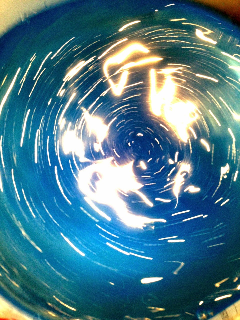
So I layered the image over my collage and I think it gave the collage a lot of depth and draws your eye into down the tunnel of light.

Finally I added a hand print and my 'BOO' graphic to make it seem like things are being sucked into it.

No comments:
Post a Comment